Oracle APEX Drawers for mobile apps
Creating apps built with ❤️ using Oracle APEX. PL/SQL dev. Exploring the AI and ML world. Keen on front-end, visual arts and new technologies. Love travel, sports, photography.
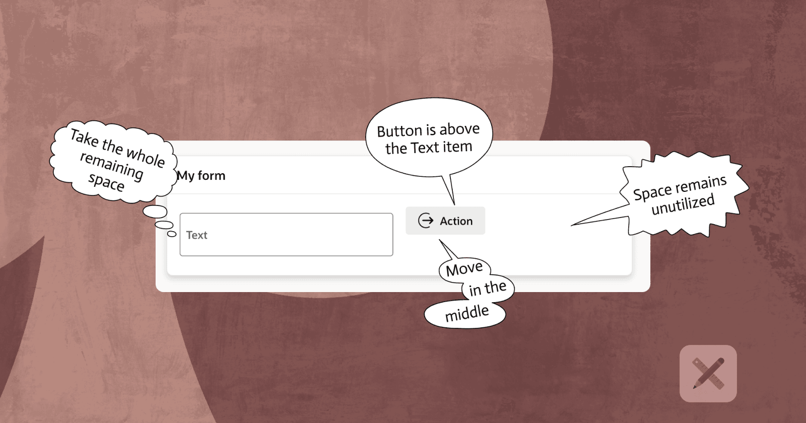
The Use Case
Oracle APEX has a special template for Dialog Pages, called Drawer. This template is also available for any Region on you Page (this time called Inline Drawer).
It's a great feature! It has many use cases and I have it in use in many apps. Especially desktop ones. However, it's not vert practical for some mobile app patterns. Here's why - this APEX template supports appearance only from left or right.
What is a common pattern for mobile apps is similar regions appearing from the bottom of the screen. To illustrate what I'm talking about, check the samples below.

Drawer pull out from the bottom
There is a good way of doing it and there is a quick and dirty one. I will describe both of them, so you could implement whatever you want.
Step 1 - Copying and modifying the Drawer templates
Go to
Shared Components/Templates(under User Interface group)Search for 'Drawer' - you should see both the
Drawer(Page) andInline Drawer(Region) templatesUse the Copy option and make a copy of each of them. You can not directly edit the built-in templates, so you need to have your own version.

- Once you have the templates, all you need to do there is add a new Template Options:
For both the Page /Drawerand Region /Inline Drawerenter the same:
| Group | Name | Identifier | Classes |
|---|---|---|---|
| Position | Bottom | POSITION_BOTTOM | js-dialog-class-t-Drawer--pullOutBottom |
Step 2 - Add some CSS
To put the pull out effect from the bottom we need some CSS. It is related to the classes we assigned to the new Template Options of both our new templates. Put this CSS in a supported place, preferably in the static Workspace/Application files in a file that is being loaded on every page open.
:root {
    --jui-overlay-background-color: rgb(80 80 80 / 85%);
}

@media screen and (prefers-reduced-motion: no-preference) {
    :root {
        --js-dialog-open-timing: .3s;
        --js-dialog-close-timing: .3s;
    }
}

.ui-dialog.t-Drawer--pullOutBottom {
    top: auto !important;
    bottom: 0 !important;
    height: auto !important;
    max-height: 100dvh !important;

    width: 99dvw !important;
    max-width: 99% !important;
    transform-origin: bottom center !important;
    border-radius: 10px 10px 0px 0px !important;

    left: 0 !important;
    right: 0 !important;
    margin-left: auto !important;
    margin-right: auto !important;
}

@media screen and (prefers-reduced-motion: no-preference) {
    .u-RTL .ui-dialog.t-Dialog--pullOutBottom,
    .ui-dialog.t-Drawer--pullOutBottom {
        animation: anim-dialogPullOutBottomOpen var(--js-dialog-open-timing, .2s) ease 1 forwards !important;
        animation-fill-mode:forwards;
        transform-origin: bottom center;
    }

    .u-RTL .ui-dialog.t-Dialog--pullOutBottom.is-closing,
    .u-RTL .ui-dialog.t-Drawer--pullOutBottom.is-closing,
    .ui-dialog.t-Dialog--pullOutBottom.is-closing,
    .ui-dialog.t-Drawer--pullOutBottom.is-closing {
        animation: anim-dialogPullOutBottomClose var(--js-dialog-close-timing,.2s) ease 1 forwards !important
    }
}

.ui-dialog.t-Drawer--pullOutBottom.t-Drawer--sm {
    height: 25dvh !important;
}

.ui-dialog.t-Drawer--pullOutBottom.t-Drawer--md {
    height: 50dvh !important;
}

.ui-dialog.t-Drawer--pullOutBottom.t-Drawer--lg {
    height: 70dvh !important;
}

.ui-dialog.t-Drawer--pullOutBottom.t-Drawer--xl {
    height: 90dvh !important;
}
CSS Explained
- This part is only about my personal preferences. You can not include it if you wish*.* I have made the overlay a little bit darker and increased the time for which the drawer appears. By default it's 0.2 seconds for opening and closing. I like it a little bit higher because I think the animation looks smoother at 0.3 seconds.
:root {
    --jui-overlay-background-color: rgb(80 80 80 / 85%);
}

@media screen and (prefers-reduced-motion: no-preference) {
    :root {
        --js-dialog-open-timing: .3s;
        --js-dialog-close-timing: .3s;
    }
}
- This part positions the drawer at the bottom of the page, sets the height, and adds other properties, so that we have the desired effect from the right position.
.ui-dialog.t-Drawer--pullOutBottom {
    top: auto !important;
    bottom: 0 !important;
    height: auto !important;
    max-height: 100dvh !important;

    width: 99dvw !important;
    max-width: 99% !important;
    transform-origin: bottom center !important;
    border-radius: 10px 10px 0px 0px !important;

    left: 0 !important;
    right: 0 !important;
    margin-left: auto !important;
    margin-right: auto !important;
}
- This part controls the animation effect when the drawer gets opened and closed
@media screen and (prefers-reduced-motion: no-preference) {
    .u-RTL .ui-dialog.t-Dialog--pullOutBottom,
    .ui-dialog.t-Drawer--pullOutBottom {
        animation: anim-dialogPullOutBottomOpen var(--js-dialog-open-timing, .2s) ease 1 forwards !important;
        animation-fill-mode:forwards;
        transform-origin: bottom center;
    }

    .u-RTL .ui-dialog.t-Dialog--pullOutBottom.is-closing,
    .u-RTL .ui-dialog.t-Drawer--pullOutBottom.is-closing,
    .ui-dialog.t-Dialog--pullOutBottom.is-closing,
    .ui-dialog.t-Drawer--pullOutBottom.is-closing {
        animation: anim-dialogPullOutBottomClose var(--js-dialog-close-timing,.2s) ease 1 forwards !important
    }
}
- This part controls the height of the drawer - it is made, so that the declarative options can be used. You can change the values as you prefer. The default height is set to
auto
.ui-dialog.t-Drawer--pullOutBottom.t-Drawer--sm {
    height: 25dvh !important;
}

.ui-dialog.t-Drawer--pullOutBottom.t-Drawer--md {
    height: 50dvh !important;
}

.ui-dialog.t-Drawer--pullOutBottom.t-Drawer--lg {
    height: 70dvh !important;
}

.ui-dialog.t-Drawer--pullOutBottom.t-Drawer--xl {
    height: 90dvh !important;
}
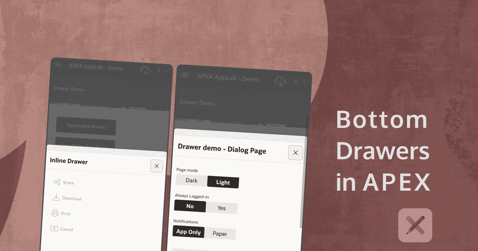
Step 3 - Using your new templates
➡️ Inline Drawer
In any of your APEX pages, create a new region.
Go to
Appearance/Templateand select the new template that we created - in my case it was the Inline Drawer PM onePick Bottom as
Positionand theSizethat you prefer. If no size is selected, it will be set to Auto, which makes the Drawer as high as the content in it. The height for the other sizes is controlled by the CSS classes we set in the previous step:
Small - 25dvh
Medium - 50dvh
Large - 70dvh
Extra Large - 90dvh

- You can trigger opening the Drawer in few ways - in my demo, I have used a
Buttonand aDynamic Actionto trigger opening the Inline Drawer.

➡️ Drawer Page
- Create a new Modal Dialog
Page. InAppearance, select your new (Page) Drawer template asDialog Template. In my case, it was called Drawer PM.

Pick Bottom as
Positionand theSizethat you prefer. If no size is selected, it will be set to Auto, which makes the Drawer as high as the content in it. The height for the other sizes are the same as the one of theInline Drawerand are controlled by the same CSS.To open this Page using the pull out effect, just redirect to it from any other APEX page. In my demo, I'm opening Page 47 (Modal Dialog) from a button in Page 46 - see the image above.
DEMO
https://oracleapex.com/ords/r/gamma_dev/demo/drawer-demo