APEX Responsive CSS Classes
Creating apps built with ❤️ using Oracle APEX. PL/SQL dev. Exploring the AI and ML world. Keen on front-end, visual arts and new technologies. Love travel, sports, photography.
The Use case (and the issue)
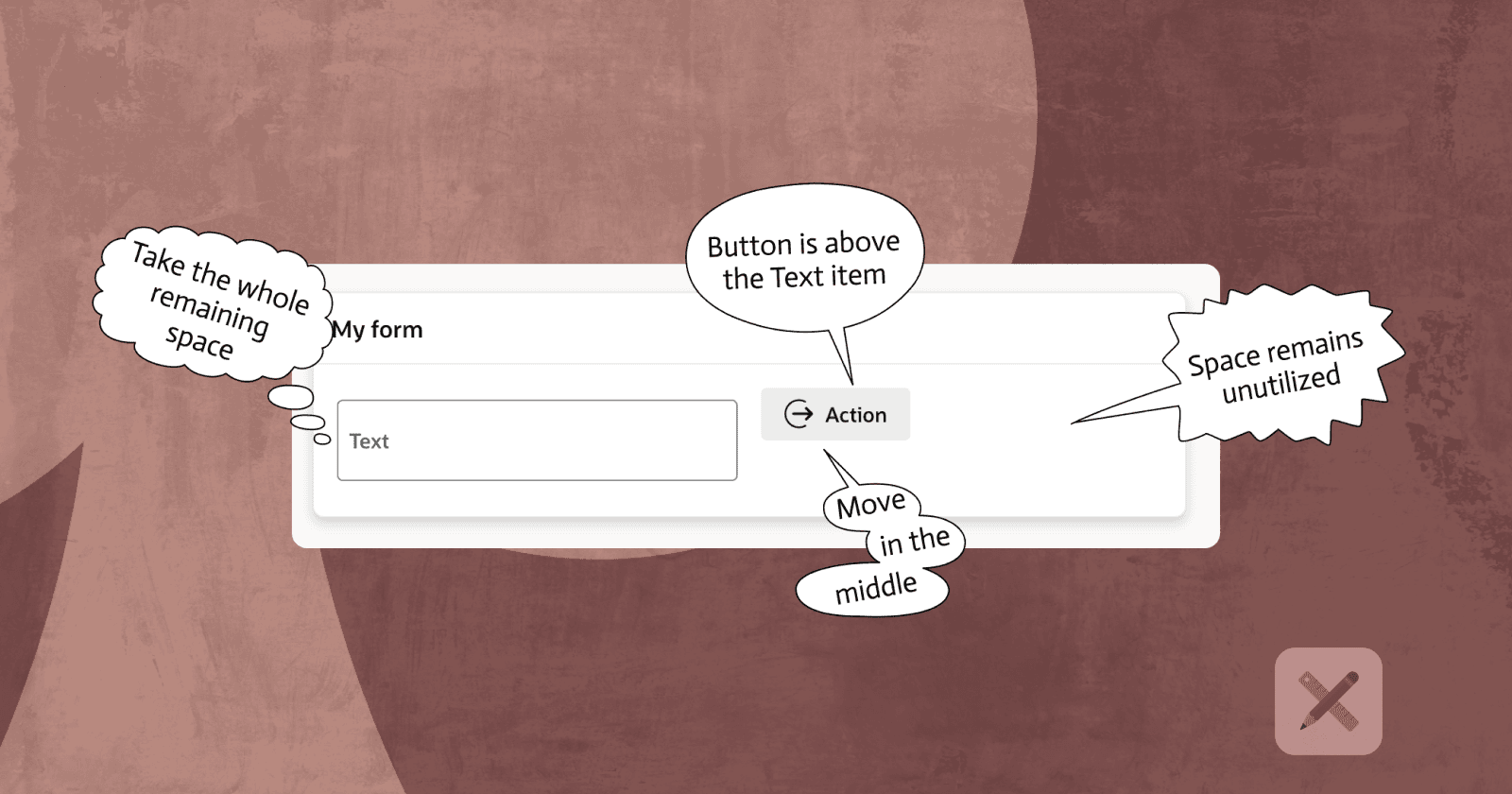
What you see on this screenshot is a pretty common requirement in an APEX application - A form, where you have some text item or dropdown menu, followed by a button or some other item. Fair enough, we have the 12 column grid available in APEX and the responsive CSS Classes to help us put them on the same row. However, there are few issues that need to be fixed, so we get the desired result.

The Built-in way (which I learned post-factum)
Item Container Template. Here are the 3 easy steps to follow ⤵️In the Container region, under
Appearance, set theTemplateproperty toItem ContainerSet the
Slotproperty of the Text item toItem(it is in theLayoutsection)Set the
Slotproperty of the Button toButton End(it is in theLayoutsection)

If you are still curious how you can do it in another way, below is an approach that I used, before I realised there is a declarative way to do it.
Custom fix for Issue number 1 - size and alignment
Buttons usually have different padding compared to the other items. Which makes the button appear above the text item in this case. That's fixable, as APEX allows us to modify the margins declaratively in the Builder. Another detail is that when Column and Column Span properties of the Layout section for each item are set, APEX assigns the following CSS classes by default - col col-6 apex-col-auto. This gives each item 50% of the row width.

A simple change of the Button properties (Size and Spacing Top), and the button looks aligned to the text item. We could additionally add a final touch by assigning the same height to both items, using some of the built-in APEX CSS Utility Classes. In this case I have added h50, which means they should both be 50px high.

Custom fix for Issue number 2 - space utilisation
The second issue I need to solve, and it's something I haven't found a way to, using the built-in CSS classes and item properties, is moving the Button to the right edge of the row and making the Text item to take all of the remaining space. The usual place where I use the APEX CSS Responsive classes (https://oracleapex.com/ords/r/apex_pm/ut/grid-layout?request=responsive_design) is the Column CSS Classes Property of each item.
So, for example, I can set the Text item to be col-8 and the Button to be col-4, which will give the Text item twice more space than the Button. However, it is not a perfect solution as there is always some extra space left around the button (or there is not enough and it gets shrunk).
Here is my solution (please share any better one if you have, especially using the declarative features and/or built-in Utility Classes):
- Add this CSS to your page or in Application/Workspace Static Files if you use some
/* APEX Grid system extension */

/* Row is a flex box and supports fill/shrink behaviour */
.row:has(.col--stretch) {
    flex-wrap: nowrap;
    align-items: stretch;
}

/* Region 1: grows to fill all remaining space */
.col--stretch {
    flex: 1 1 auto;
    min-width: 0; /* prevents overflow */
    max-width: 100%;
}

/* Region 2: shrinks to fit its content width, never truncates */
.col--shrink {
    flex: 0 0 auto;
    width: max-content;
    max-width: 100%;
}
/* END of Grid system extension */
Add the following CSS class (
col-auto col--stretch) to the Text item (the one that should stretch) in theColumn CSS Classesproperty
Add the following CSS class (
col-auto col--shrink) to the Button (the one that should stay static on the right side) in theColumn CSS Classesproperty
Turn off the toggle on the Button (or any other item that you want to stay static on the right) for the
Start New Rowproperty
Final Result
The final result is just what I needed - a Button with fixed width, staying always on the right and a Text item, which takes all of the remaining space. If you run the demo, do an experiment - open the Browser dev Tools and start shrinking the page - the items continue to behave the expected way, as the Button does not use any extra white space and the Text item always takes the whole remaining space to the left.