From Prototype to Great Application Component
The process behind creating an APEX Template Component from scratch
Creating apps built with ❤️ using Oracle APEX. PL/SQL dev. Exploring the AI and ML world. Keen on front-end, visual arts and new technologies. Love travel, sports, photography.
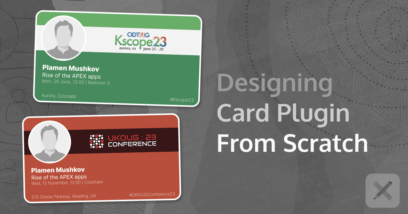
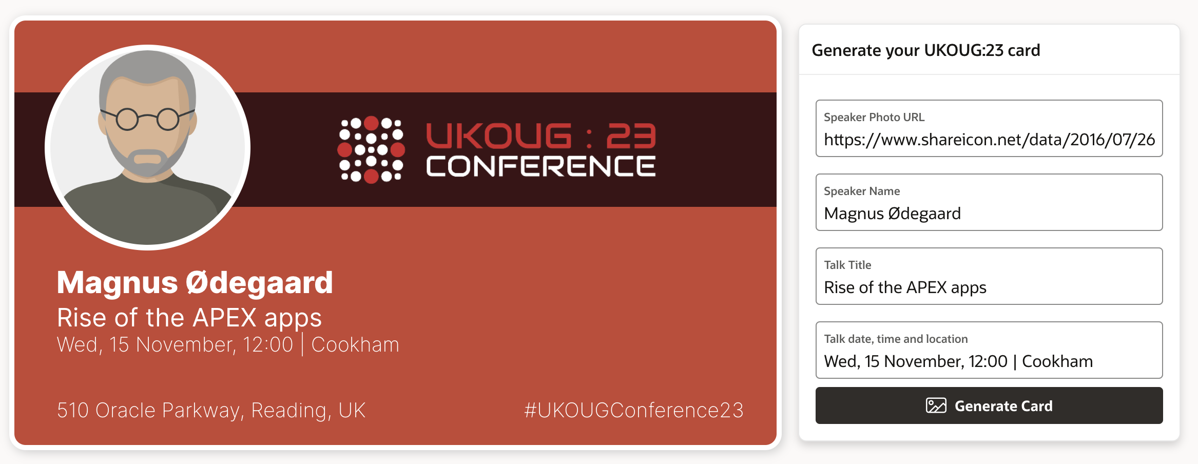
Since I have been on a Template Component exploration journey, and at the same time I will be speaking at the UKOUG conference in Reading in November, I decided to combine both topics and create a Plugin that would allow other speakers to create their own Conference Cards. Including a photo, conference logo and details about their Session, such as title, date and time and conference room.
Here is my ten-step journey to create this APEX Template Component Plugin from scratch. You'll need some HTML and CSS knowledge along the way if you want to fine-tune the end result. But you can always start small and build upon it. Have fun!
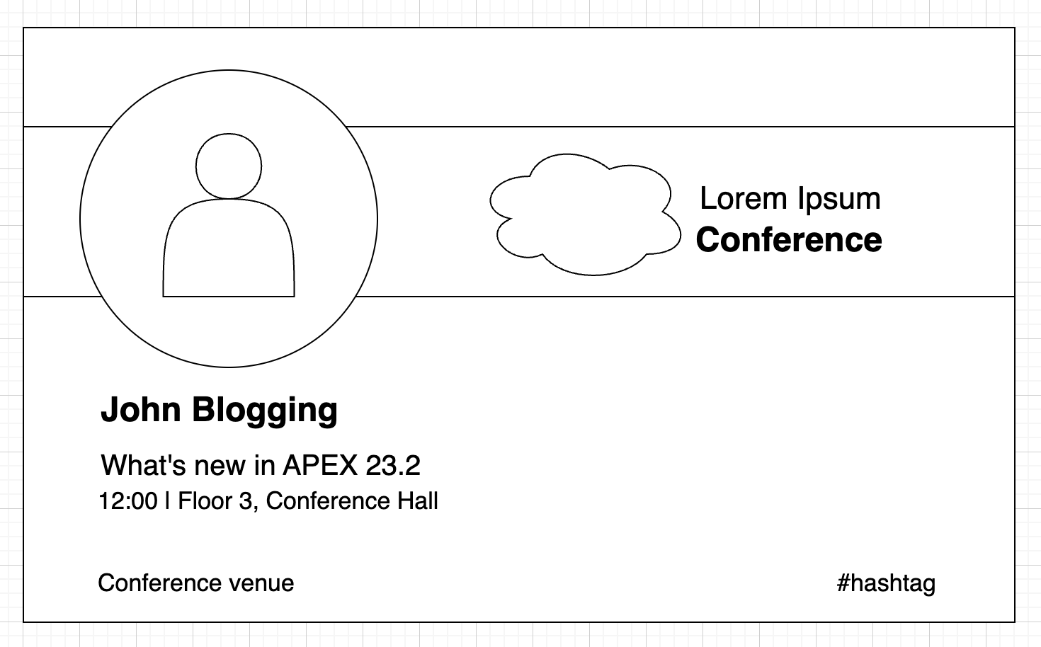
Step one - create a very basic sketch, an illustration or an image of the component you want to create. Make sure to include a sample text or a placeholder for all the information you would have in it. Here is a sample of a very basic design that I created for my Template Component.
Step two - create a very basic HTML skeleton for each section of your design. For the above design - something like this:
<div class="card_wrapper"> <div class="card_top"></div> <div class="card_conference_logo"></div> <div class="card_presenter_image"></div> <div class="card_data"> <div class="card_person_name"></div> <div class="card_talk_title"></div> <div class="card_talk_time"></div> <div class="card_conference_venue"></div> <div class="card_conference_hashtag"></div> </div> </div>💡Note that in this step I have started adding CSS classes that I will later use to style my component. I am giving them meaningful names, so they match the parts of my prototype.Step three - Create a
Static Contentregion in APEX and paste your skeleton HTML in theSourceattribute. We are going to use this skeleton and style it live using the browser Dev Tools. This and the next steps are where you can get creative and play around with CSS classes and attributes until you get the desired visual result.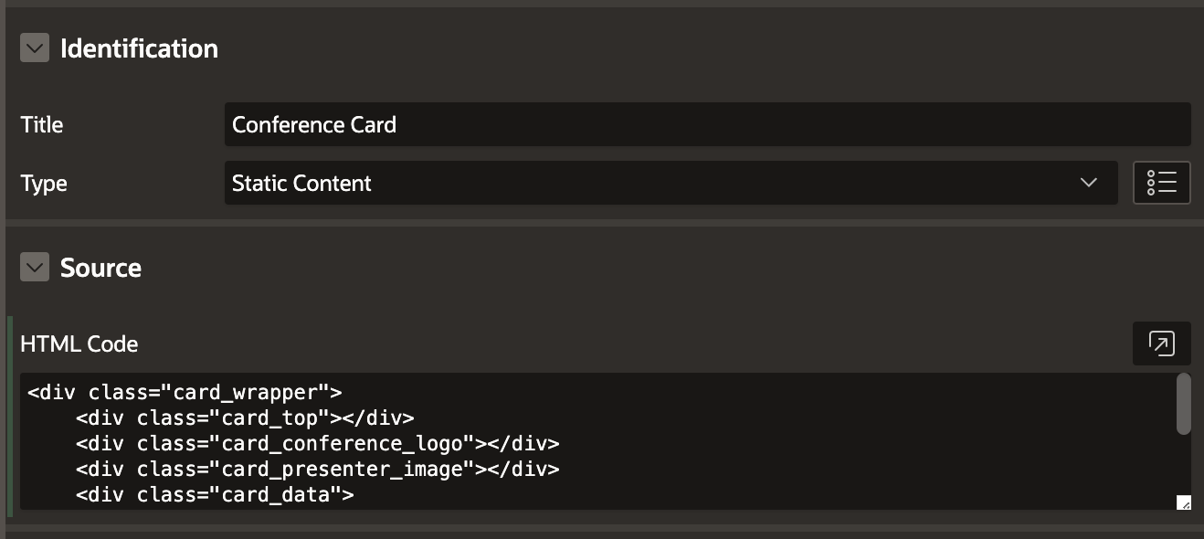
Step Four - After loading the APEX page, initially you will see nothing - the skeleton will need you to start adding attributes to the CSS.
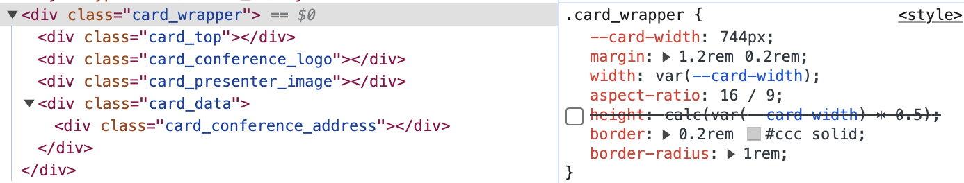
After adding the following CSS ...
.card_wrapper {
   --card-width: 100%;
   margin: 1.2rem 0.2rem;
   width: var(--card-width);
   aspect-ratio: 16 / 9; /* height will be 9/16th of the width */
   /* height: calc(var(--card-width) * 0.5); */ /* optional way of calculating height */
   border: 3px #ccc solid;
   border-radius: 16px;
}

.card_top {
   width: 100%;
   height: calc(var(--card-width) * 9/16 * 0.15);
   border: 2px #ff9d04 solid;
   border-radius: 13px 13px 0px 0px;
   background-color: #fff0e1;
}

.card_conference_logo {
   width: 100%;
   height: calc(var(--card-width) * 9/16 * 0.25);
   border: 2px #00d518 solid;
   background-color: #f7fff8;
}

.card_data {
   width: 100%;
   height: calc(var(--card-width) * 9/16 * 0.60);
   border: 2px #17c7fe solid;
   border-radius: 0px 0px 13px 13px;
   background-color: #edfbff;
}
My skeleton now looks like this on my APEX page:
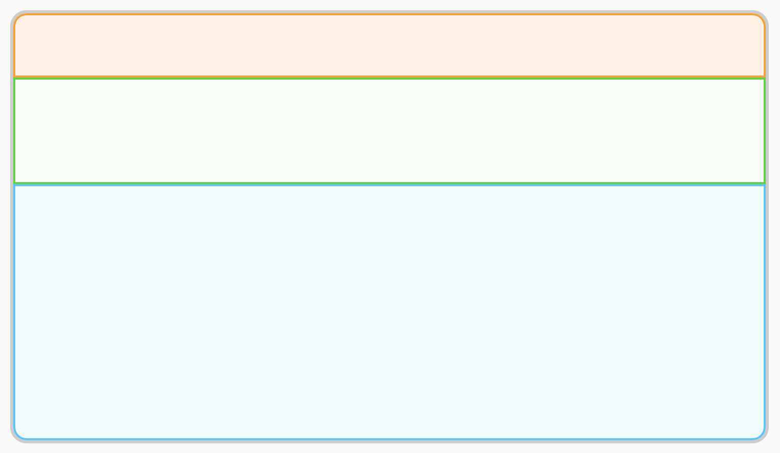
I have done on purpose some things to help me during this phase:
Heights, Paddings and Font Sizes are all calculated using the calc() function as a fraction of the card width.5. Step five- Start adding some data. I used the details for my next talk at UKOUG in November. The CSS got bigger, I aligned the layers, started using a new font ("Inter", the same that I used for my prototype), changed the font size and weights and so on. The card started to take shape now.@import url('https://fonts.googleapis.com/css2?family=Inter:wght@200;400;600;800&family=Roboto+Serif:opsz,wght@8..144,100&family=Roboto:wght@100&display=swap');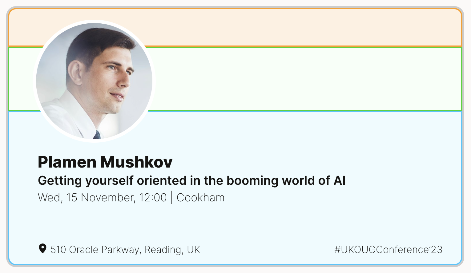
6. Step six- Complete CSS development. The card should now have its final look, with all values being hardcoded. In the next steps, we will move our HTML, CSS and JS into a Template Component Plugin and add placeholders to enable dynamic content and design of our card. You can see it all once I upload the plugin and make it public. Stay tuned!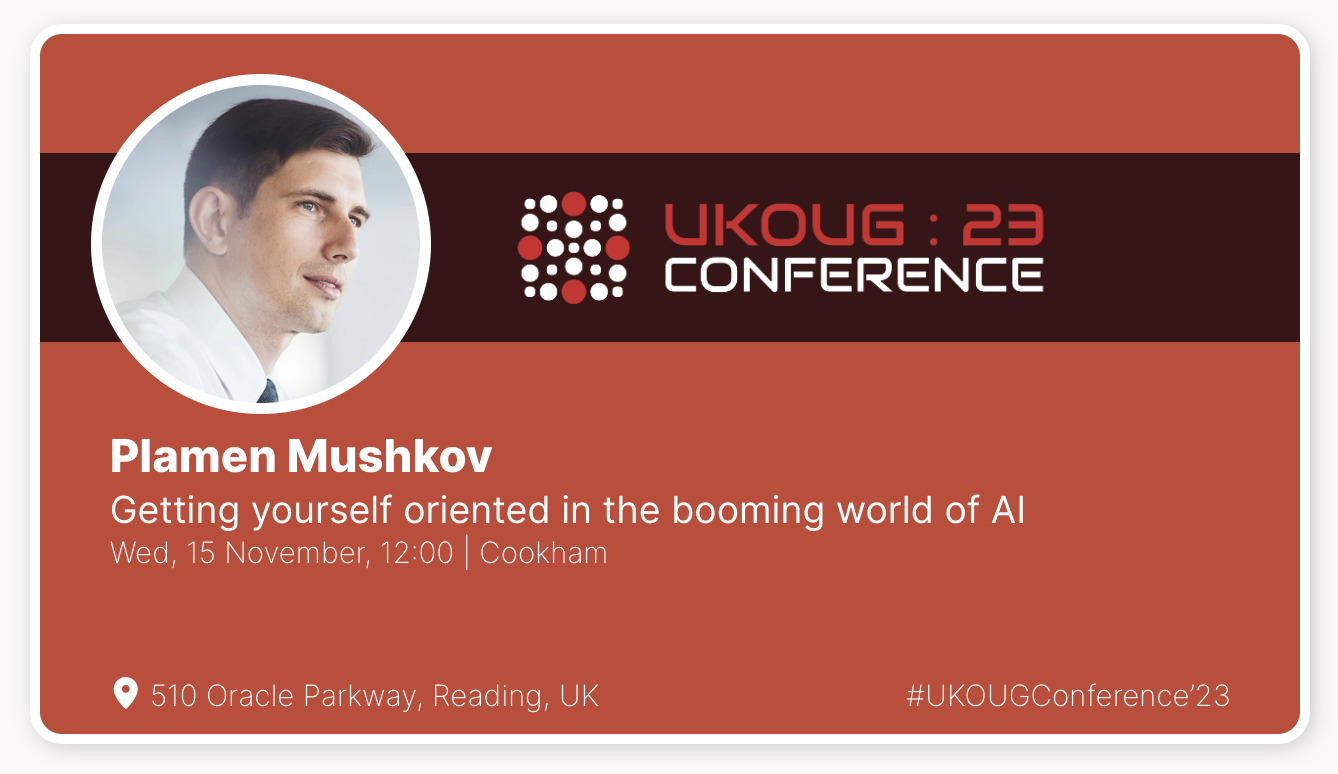
7. Step seven- Create a new Template Component Plugin. Place the HTML into thePartialsection and add placeholders instead of the hardcoded values you used during the design phase.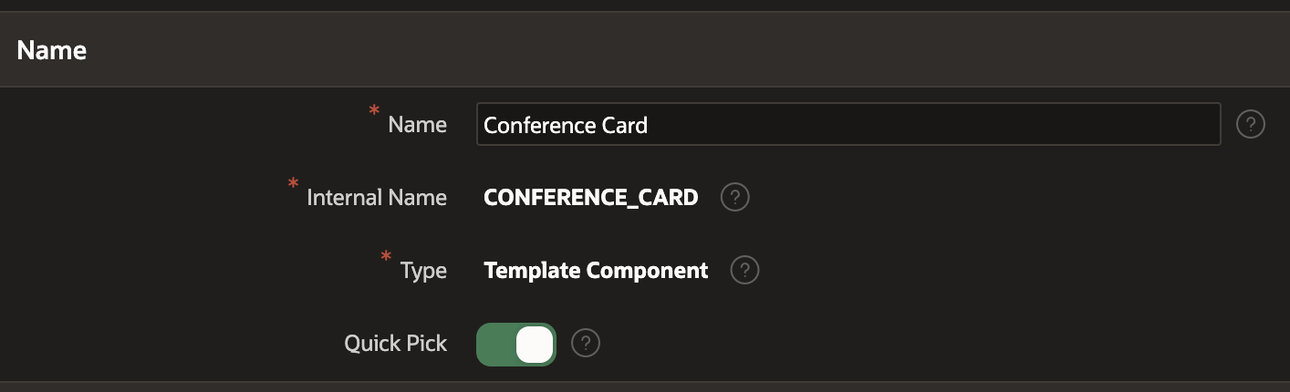
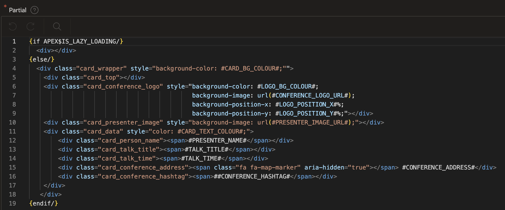
8. Step eight- Put your CSS styles in a file, calledconference_cards.css. This file should be part of your plugin files. I will not paste the whole CSS, as it is rather big, but you can find it once you download and install the Plugin.Just want to stress on this part:
<div class="card_data" style="color: #CARD_TEXT_COLOUR#;">
   <div class="speaker_data">
      <svg xmlns="http://www.w3.org/2000/svg" viewBox="0 0 300 50" style="width: 100%;height: auto; fill: #CARD_TEXT_COLOUR#;">
         <text class="card_person_name">#PRESENTER_NAME#</text>
         <text class="card_talk_title">#TALK_TITLE#</text>
         <text class="card_talk_time">#TALK_TIME#</text>
      </svg>
   </div>
   <div class="footer_data">
      <svg xmlns="http://www.w3.org/2000/svg" viewBox="0 0 300 20" style="width: 100%;height: auto; fill: #CARD_TEXT_COLOUR#;">
      <text class="card_conference_address">#CONFERENCE_ADDRESS#</text>
      <text class="card_conference_hashtag">##CONFERENCE_HASHTAG#</text>
   </svg>
   </div>
</div>
svg text.card_person_name {
   transform: translate(0px, 13px);
   font-size: 0.75rem;
}
svg text.card_talk_title {
   transform: translate(0px, 26px);
   font-size: 0.625rem;
}
svg text.card_talk_time {
   transform: translate(0px, 36px);
   font-size: 0.5rem;
}

svg text.card_conference_address {
   transform: translate(0px, 10px);
   font-size: 0.5rem;
}
svg text.card_conference_hashtag {
   transform: translate(184px, 10px);
   font-size: 0.5rem;
}
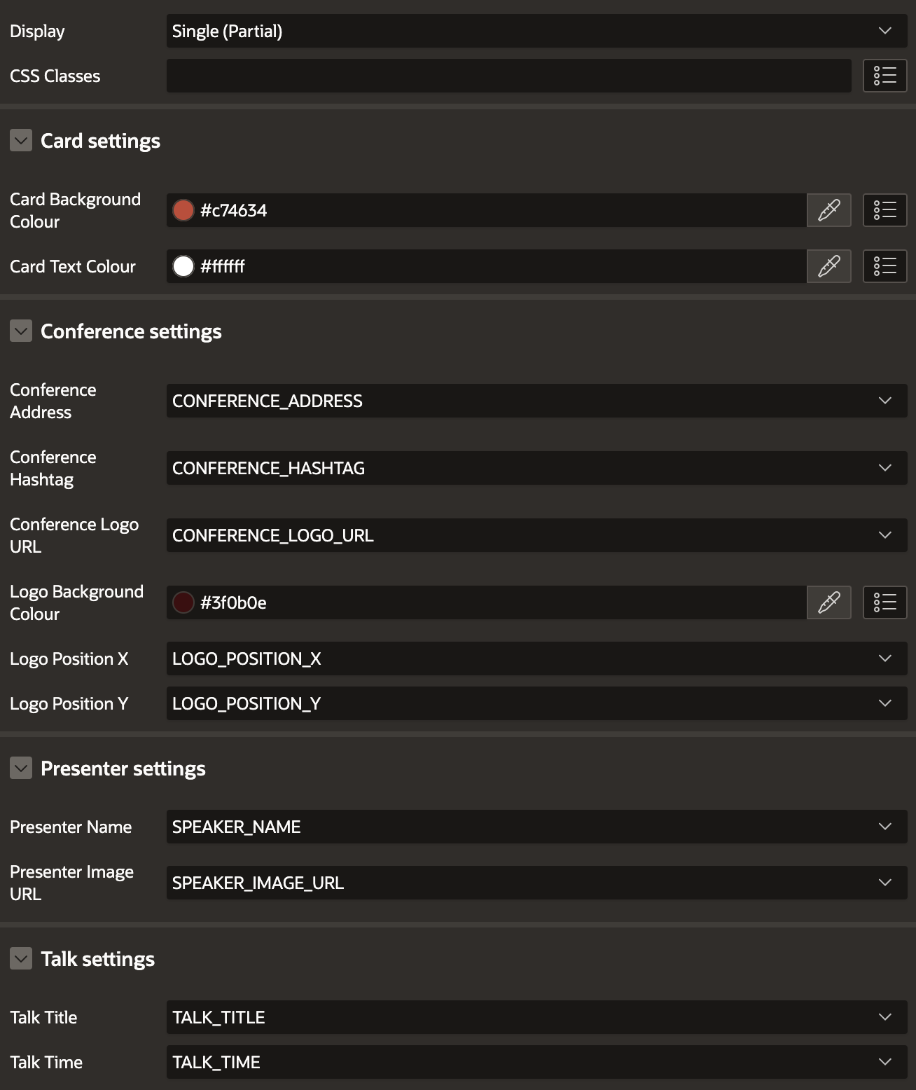
9. Step nine- AddDefault Values,Help Text, andSequence Valuesto your Template Component Plug-inCustom Attributes.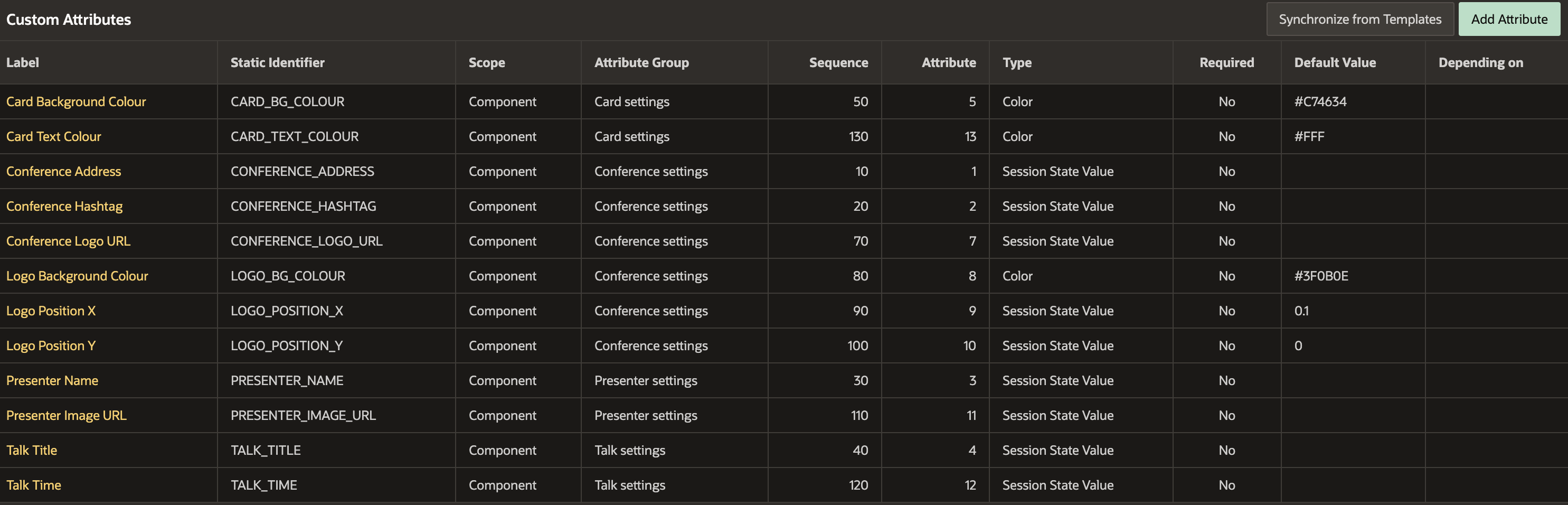
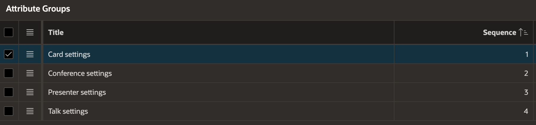
Group your Attributes into Attribute Groups for better UX.
10. Step ten - Use your new Template Component Plugin in an APEX page. Use a SQL query like the one below as a source and map the columns to the Template Component placeholders in the Attributes section of the Plugin.
 select
    'Plamen Mushkov' SPEAKER_NAME,
    'Getting yourself oriented in the booming world of AI' TALK_TITLE,
    'Wed, 15 November, 12:00 | Cookham' TALK_TIME,
    '510 Oracle Parkway, Reading, UK' CONFERENCE_ADDRESS,
    'UKOUGConference’23' CONFERENCE_HASHTAG,
    '#APP_FILES#conference_card/profile_400x400.jpeg' SPEAKER_IMAGE_URL,
    '#APP_FILES#conference_card/conference_logo.png' CONFERENCE_LOGO_URL,
    null LOGO_POSITION_X,
    null LOGO_POSITION_Y
from dual
That's it - enjoy the plugin. Here is a Demo page I built to demonstrate it. Give it a try and generate your own Speaker Card if you attend a conference soon.
🪪 https://apex.oracle.com/pls/apex/r/gamma_dev/demo/conference-cards
Download
Do you like how it looks? Download the plugin now and give it a try!
Follow me
Did you like this article? Follow me! 🔔