A glimpse of the APEX 22.2 new features - Autocomplete

Creating apps built with ❤️ using Oracle APEX. PL/SQL dev. Exploring the AI and ML world. Keen on front-end, visual arts and new technologies. Love travel, sports, photography.
Text Field with Autocomplete
The
Autocompleteitem has been reimagined as a native APEX web-component and provides a more streamlined user experience, support for icons, cascading list of values, and more.
Allowing developers to have more control over this item makes it a good option to use instead of Popup LOV or the Select List items. It is something in-between these two and the Text Field item. Depending on the use case, especially when there is a big number of results that should be available to select from, the Text Field with Autocomplete item, with 'Lazy Loading' (or 'Fetch On Type' as it is now named in 22.2) turned on can decrease the loading time and only display as many results as needed and only when needed. The item itself is simpler that the Popup LOV and doesn't display additional popup which I personally prefer.
How is the Text Field with Autocomplete improved in version 22.2?
There are several improvements, which make this item even more appealing:
- In previous versions, it was based on the JET library, now it has been rebuilt as native APEX web-component and allows some modifications directly using the HTML attributes of the item. Note the new a-autocomplete HTML element for the item.
<a-autocomplete id="P5_AUTOCOMPLETE" class="apex-item-has-icon" value="" ajax-identifier="aabbccddeeff" fetch-on-type="true" match-type="contains" min-characters-search="1" max-results="20" cache="true" parents-required="true" size="30">
    <input type="text" class="apex-item-text apex-item-auto-complete" name="P5_AUTOCOMPLETE" aria-labelledby="P5_AUTOCOMPLETE_LABEL" value="" size="30" id="P5_AUTOCOMPLETE_input" role="combobox" aria-expanded="false" autocomplete="off" autocorrect="off" autocapitalize="none" spellcheck="false" aria-autocomplete="list" aria-busy="false" aria-controls="CS_5_P5_AUTOCOMPLETE" tabindex="0">
</a-autocomplete>
- When displayed inside of Modal Dialogs, it now behaves correctly and you don't need to resize the dialog so you can see all item values.
- User searches are more accurate now, as the four different Search options are still available
- The item can also use
Cache, so it doesn't make a request to the server every time for displaying a set of results. This could lead to a massive loading boost. Lazy Loadingoption is now renamed toFetch on Type, but it still does the same - loads results only when user actually starts typing and not everything at page load.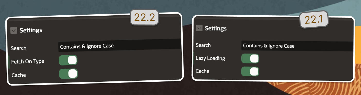
The Autocomplete item now supports icons for the search results. That could be enabled if you specify a
LOVthroughShared Components, where you map a specific column of your query as the icon CSS class (for example the Font Awesome icons, like fa-bicycle).
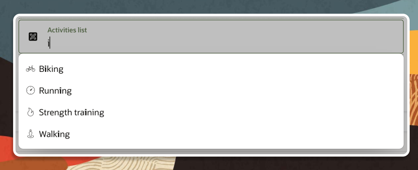
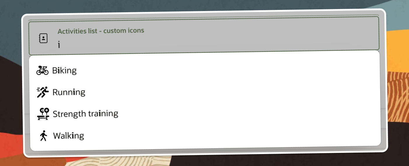
Setting custom made icons to the Autocomplete results
As seen on the above image, the new Text Field with Autocomplete now supports the Icons, as set in a List of Values (LOV). The only tricky moment is that these Icons are displayed through the CSS class. The built-in Font Awesome icons can be displayed using the fa- classes, but are not always enough for our needs.
Here is what the HTML of the Autocomplete results icons looks like:
<span class="a-ComboSelect-icon a-Icon fa fa-bicycle" aria-hidden="true"></span>
The span element comes with three default classes - a-ComboSelect-icon, a-Icon and fa. The last one - fa-bicycle is the one we have specified in the LOV. This means that the span will be 16x16px or whatever the --a-icon-size CSS variable is set to.
.a-Icon {
    height: var(--a-icon-size,16px);
    width: var(--a-icon-size,16px);
}
How do we get a custom images as icons, instead of the Font Awesome ones?
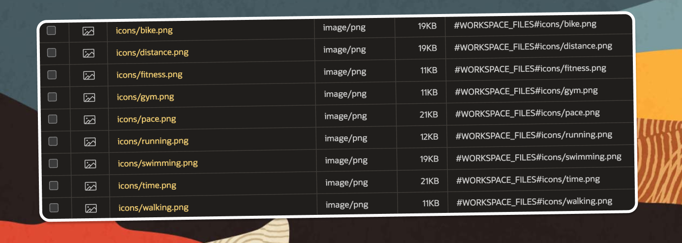
- Upload your icons to the
Static ApplicationorStatic Workspace Files
- Create a CSS file like
css/global.cssagain inStatic ApplicationorStatic Workspace Files. Then reference it in your page using the reference#WORKSPACE_FILES#css/global#MIN#.css.
.pm-icon {
   background-repeat: no-repeat !important;
   background-size: 20px 20px !important;
   background-position: center !important;
   width: 20px;
   height: 20px;
}

.pm-icon-running {
   background: url(../icons/running.png);
}

.pm-icon-walking {
   background: url(../icons/walking.png);
}

.pm-icon-biking {
   background: url(../icons/bike.png);
}

.pm-icon-workout {
   background: url(../icons/pace.png);
}

.pm-icon-gym {
   background: url(../icons/gym.png);
}
We do this in order to set the icon size and use the icon file as a background image for the span element, rendering the Autocomplete results.
- Create a new
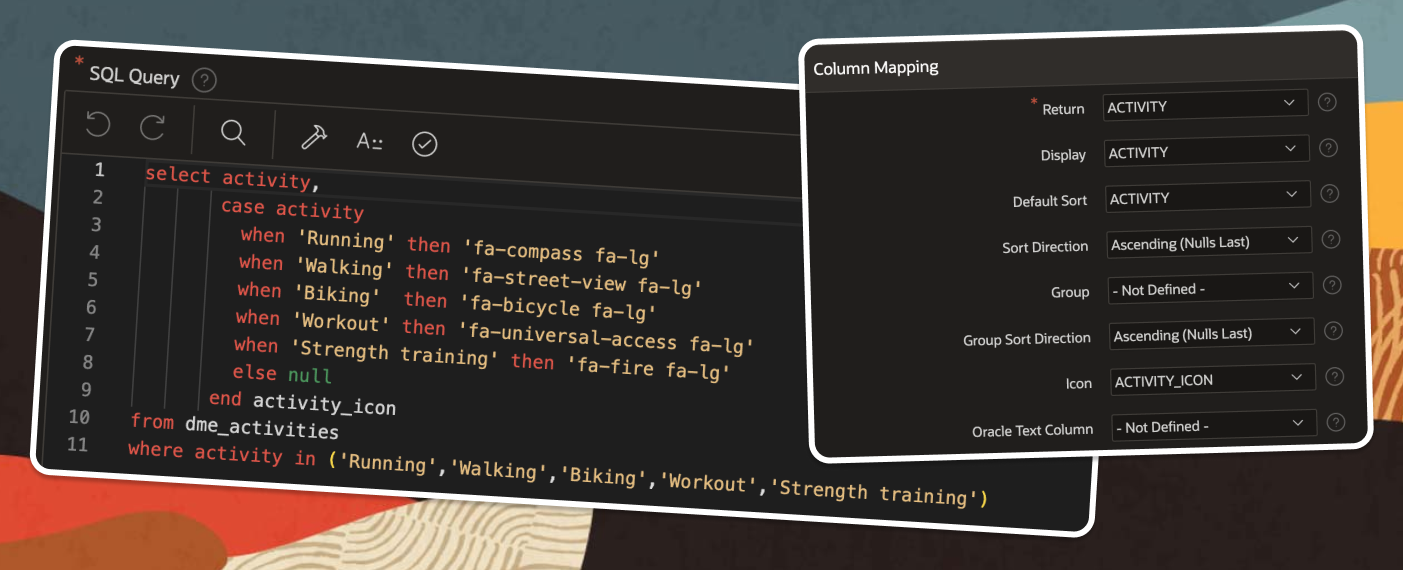
List of ValuesfromShared Components. For the SQL Query source, I am using something similar:
select activity,
       case activity
         when 'Running' then 'pm-icon pm-icon-running'
         when 'Walking' then 'pm-icon pm-icon-walking'
         when 'Biking'  then 'pm-icon pm-icon-biking'
         when 'Workout' then 'pm-icon pm-icon-workout'
         when 'Strength training' then 'pm-icon pm-icon-gym'
         else null
       end activity_icon
from activities
where activity in ('Running','Walking','Biking','Workout','Strength training')
Note that we use here the same pm-icon CSS classes, defined in global.css file.
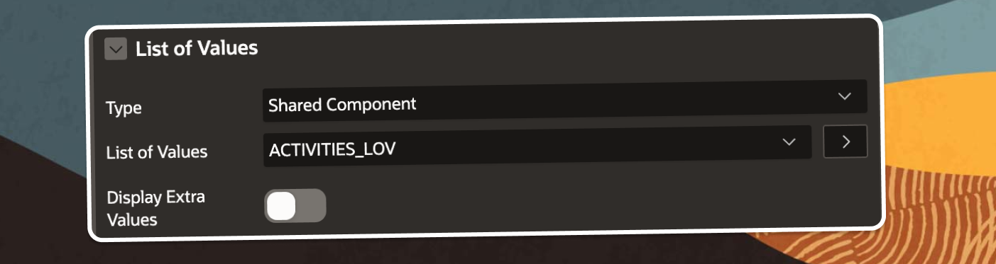
Map the Columns in the
Column Mappingsection of the LOV as follows: Return:ACTIVITYDisplay:ACTIVITYIcon:ACTIVITY_ICONBack on the Page, select your
Text Field with Autocomplete, go to theList of Valuessection and select the newly created LOV.
- Well Done. Your Autocomplete with custom Icons is ready to rock!
Follow me
Liked that post? Follow me on Twitter and LinkedIn!
🔷 @plamen_9 on Twitter
🔷 Plamen Mushkov on LinkedIn